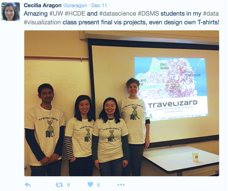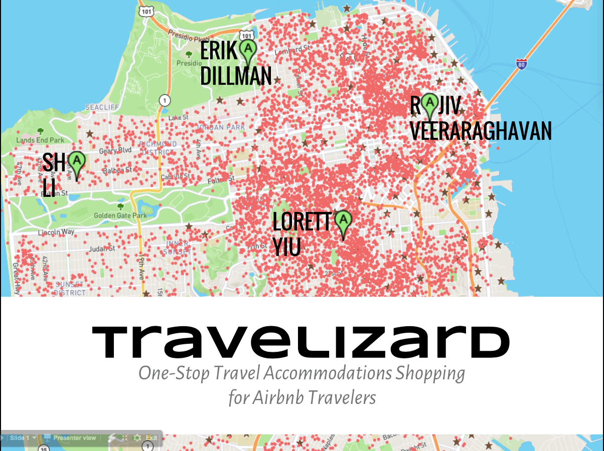
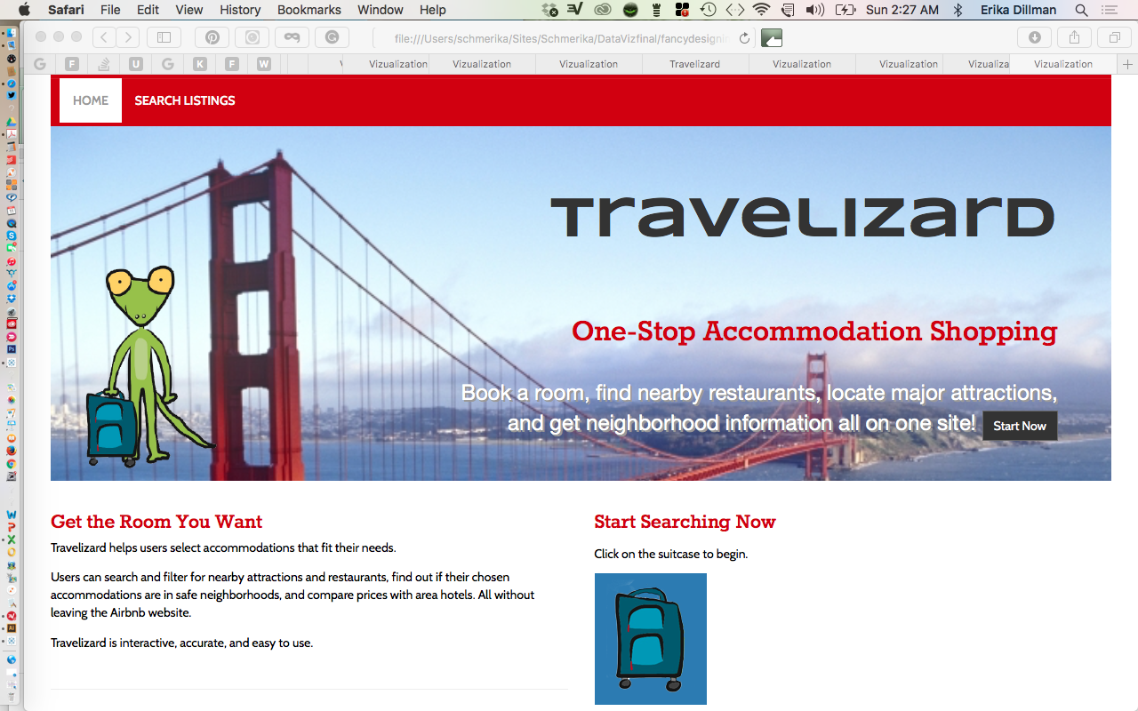
Our four-person team created Travelizard, a data visualization of Airbnb lodgings that showed nearby attractions, dining options, and safety information.
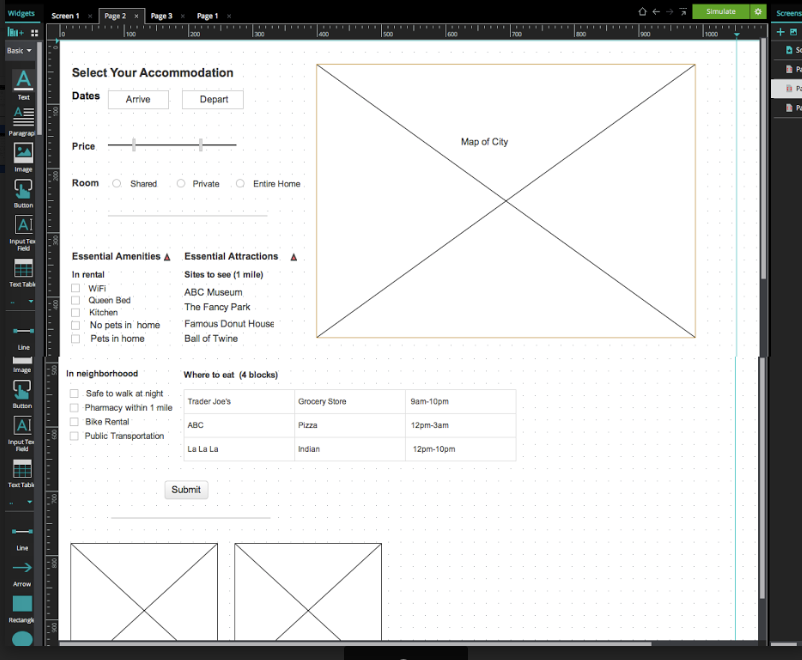
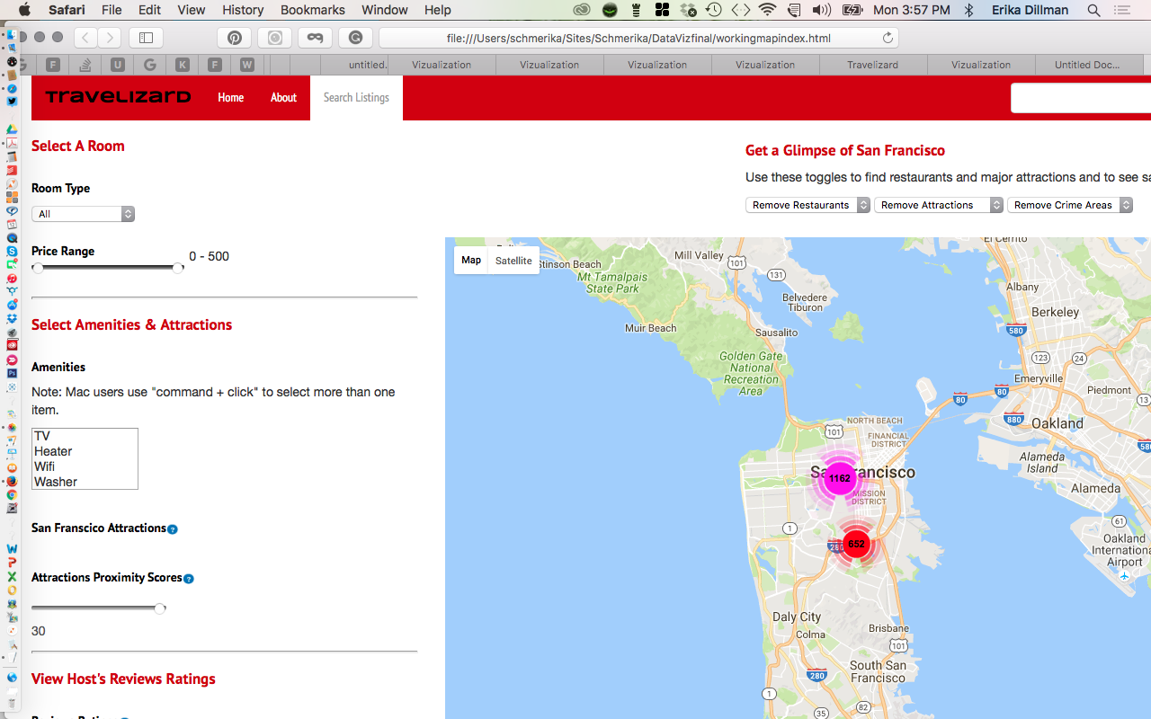
We created the visualization to provide people searching for Airbnb accommodations with a variety of variables to search for when looking for places to stay. As users select variables, their options appear on a map of the city.
Initially, we used Tableau and Map Box to make a visualization of Tableau datasets. One team member scraped the datasets, and another fed them into Tableau.
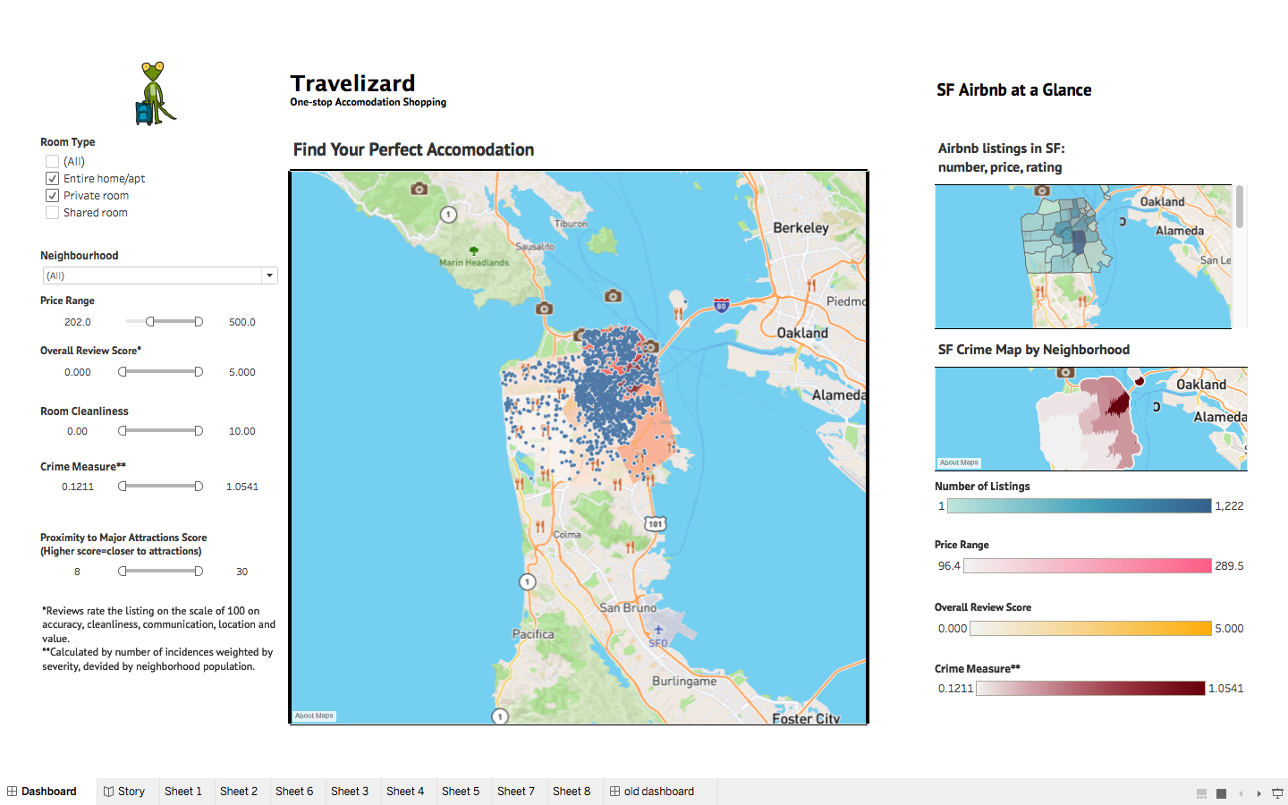
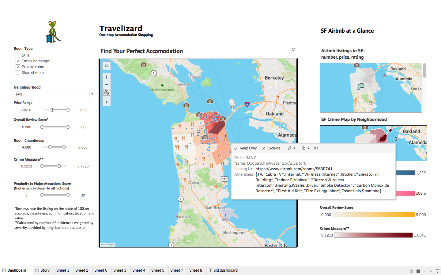
As we worked to add more search variables, we were unable to create our visualization in Tableau. So, one team member volunteered to learn javascript while I created a wireframe, then a basic webpage to hold the code that would give us our searchable map.
The task of creating our visualization from scratch was immense. We all worked overtime to finish this project.
Here’s us giving our final presentation: