Our team of three people worked on the redesign of the SHAREWHEEL site to make it easier to use. One team member was the project manager, another was the designer, and I was in charge of content strategy and information architecture.
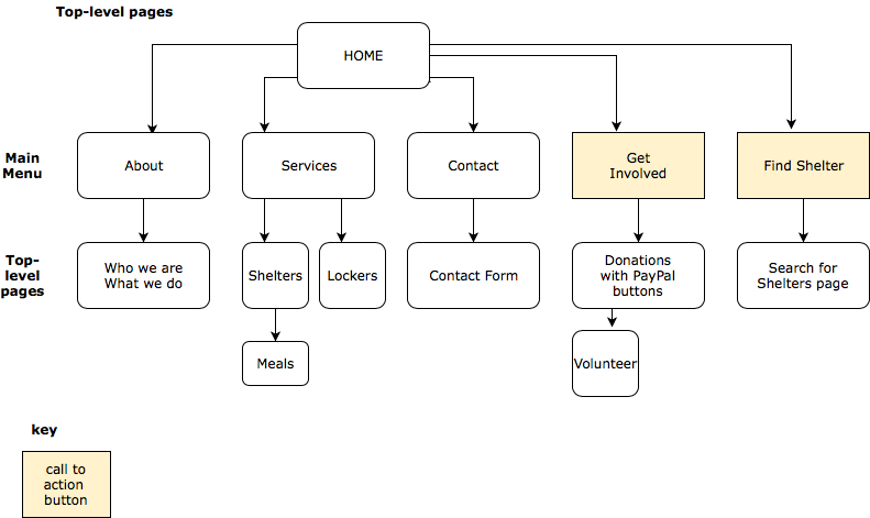
First step, create basic information architecture and content strategy. During a card sorting exercise, we were able to get the client to prioritize business and site goals, allowing us to reduce the menu items from 20+ to five options. I also conducted a content audit of the client’s site, as well as a comparative analysis with similar sites.
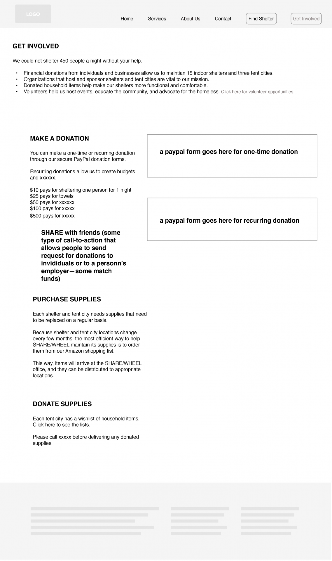
The organization is very proud of its work. I wanted to honor that (as well as be realistic about our time constraints) by using text/content written by members for the original site. I edited the information down to the essentials, then planned to put condensed versions of content-heavy sections onto back pages.
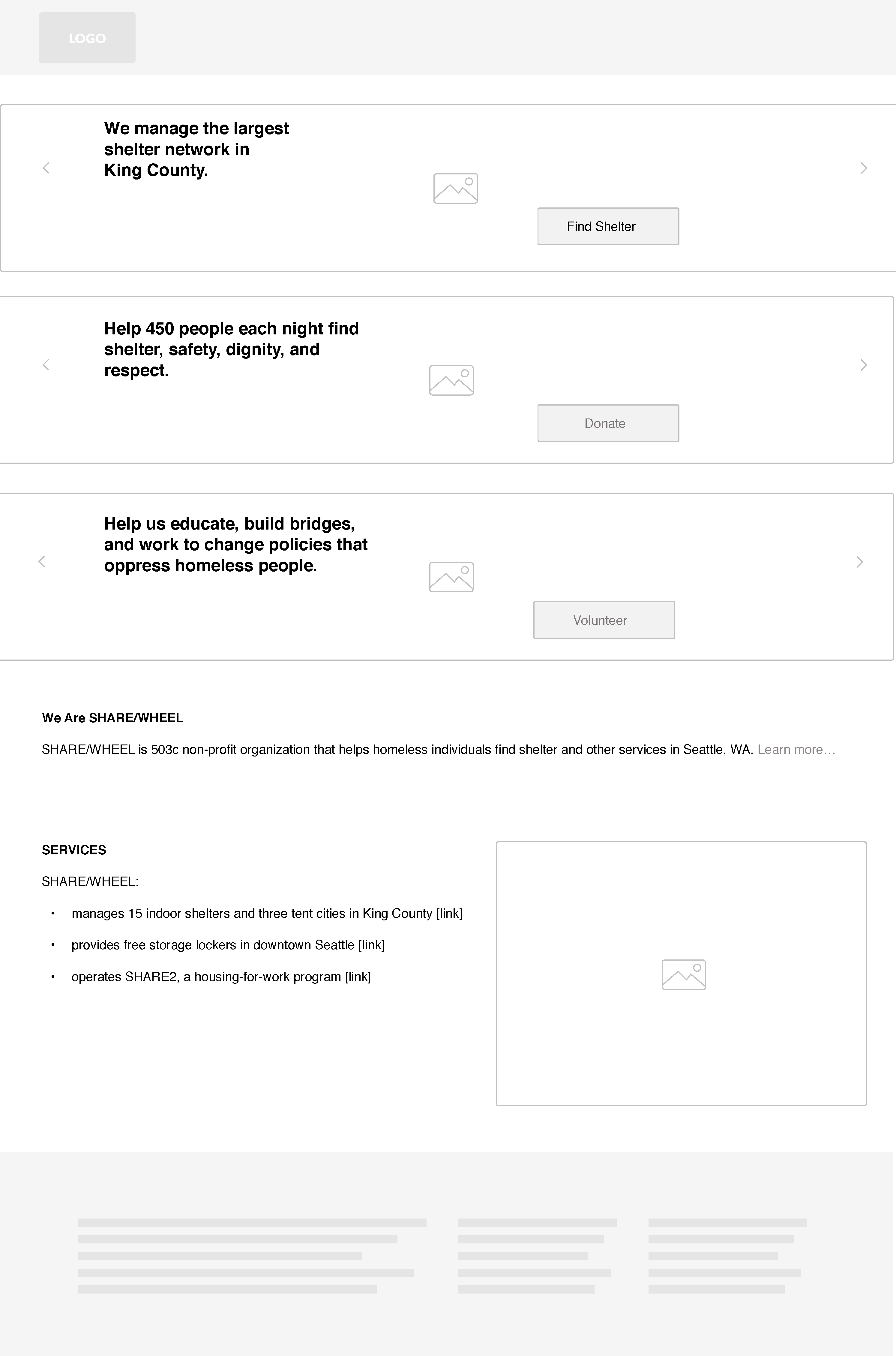
For the “about” pages for each of the two organizations I used a bulleted list and a goal statement, along with large photos that conveyed “pride” and “community.” Users can click on links to reach more detailed content located on lower-level pages.
Initially, we were not sure if the client was more focused on getting people involved with the organization (as volunteers or sponsors) or with increasing donations. Additionally, the organization did not really have a structure set up for scheduling volunteers on a regular basis; their need was more sporadic and seasonal. So I created a page that users arrived on after clicking “get involved” that was designed for taking action. The headings are bold and direct to show the reader what’s need and where they should read about it. The page was primarily concerned with money, with a link to a new page for users to learn about volunteer opportunities.